Terra Biking Mobile
Terra Biking’s Mobile project is a complimenting project to Terra Biking PC that focused on the consistent aesthetic and visual design of its PC counterpart, I wanted to capture the continuous sleek nature and identity that Terra Biking portrays in their values and design and what these pillars represent, a natured night sky, mountainous terrain and strong modernistic design in perfect balance.
Strategy & UX
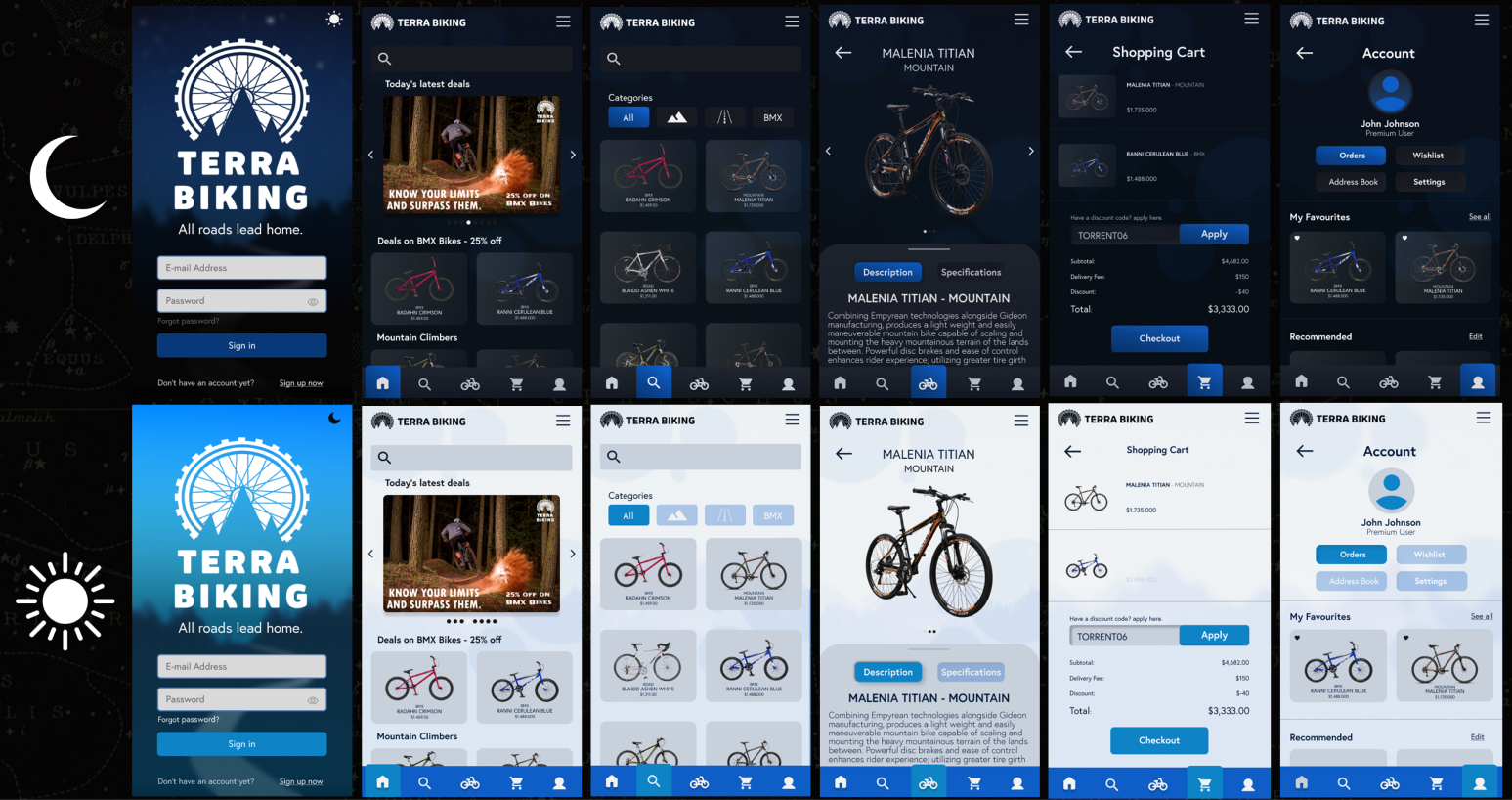
The primary goal of the project was to further enhance the useability of the site, implementing ease of life interactivity for the user to have access to, such as a day/night mode, the option to an create account, access to account settings, options to browse the store and deals and successfully purchasing items from the cart; creating an easy user flow was integral to the design so that the users don’t get lost in the menus and allowing them to directly find what they’re looking to access.
I also began conducting user research via feedback from users who accessed competitor sites; this allowed me to understand user expectations and needs when accessing the user flow of a website; using this information gained I focused on creating a flow that was concise and clear, allowing for intuitive navigation and easy access to important features and informational sources that the user may desire in their flow of the site.
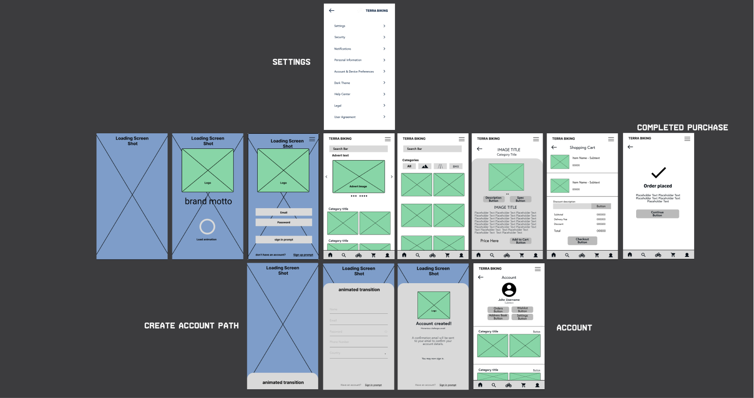
Below is a set of wireframe samples I had created during the research and UX phase of the project, the goal of the wireframe was to create an efficient and informative use of user time and flow to access all the important sources of information.
Aesthetics & UI
In the desire of efficiency and consistency in design, I wanted to remain continuous with the PC aesthetic, using the colour palette and components showcased in both the design and by the business itself, representing sleek modernistic design while holding onto its nature-oriented origin.
This desire and goal to remain consistent in the design opened a new experience in the project, applying a day/night mode would assist in user control but also allowed the user to alternate different version of the site depending on what they desired at the time of use; it pushed the use of the components created for the project itself alongside user preference.
User Control
The issue I found with research is that a lot of sites that use mobile stores was that there was always a risk for the user to get lost in the menus, so I decided on following a hierarchy of information that the user would naturally flow through in terms of priority, such as deals and title cards that scroll through varying sources of information, while also providing the user with tabs at the bottom and also a search function.
It's important that there were many different ways a user could access the desired information they were seeking, taking accessibility into account I wanted there to be icons that users could instantly understand and use for an even faster use of flow if they found the scrolls information tabs or the search bar to be less fruitful in their experience.
Final Thoughts
It was an interesting experience creating a variation of a completed product, it let me experience issues that weren’t otherwise found in the original such as a day/night mode and reintegrating components that were previously created and used in the project and changing their elements to fit the new versions; this project also had a store integrated in the design that the previous iteration didn’t as it was mostly just for showing off the websites aesthetic and layout.