Tanuki Hut
Tanuki Hut is a project that consisted of creating a brand identity for a Japanese Bubble Tea and healthy food business, serving all vegan products such as fruit bubble teas and Japanese cuisine, their colour palette was a deep green and brown to represent the connection to nature and their all-vegan menu, and the representation of the Tanuki.
Project Goal
The goal of the project was to produce a brand identity for a Japanese Business named Tanuki Hut; the location of their business was located on 8 street in Garden City, a location that featured a large portion of Japanese restaurants. With this knowledge in mind I was tasked with creating an identity that would stand out from the typical surrounding restaurant indentities. (all images and assets belong to their respective copyright holders.)
Identity & Research
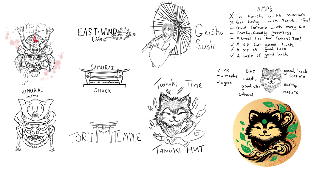
The first step in the project was to research identity within Japanese Culture, to understand and establish what identity would separate itself from competitor identities.
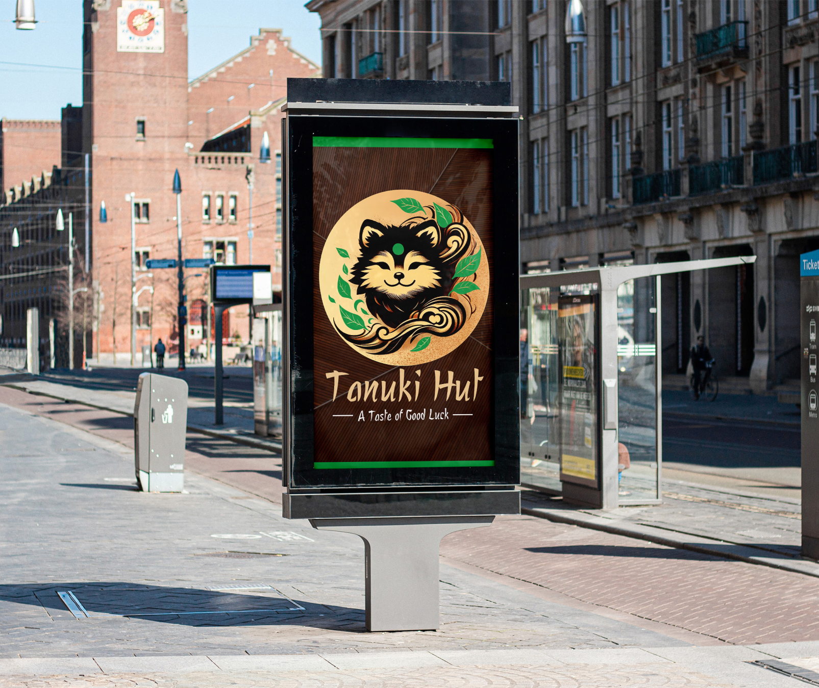
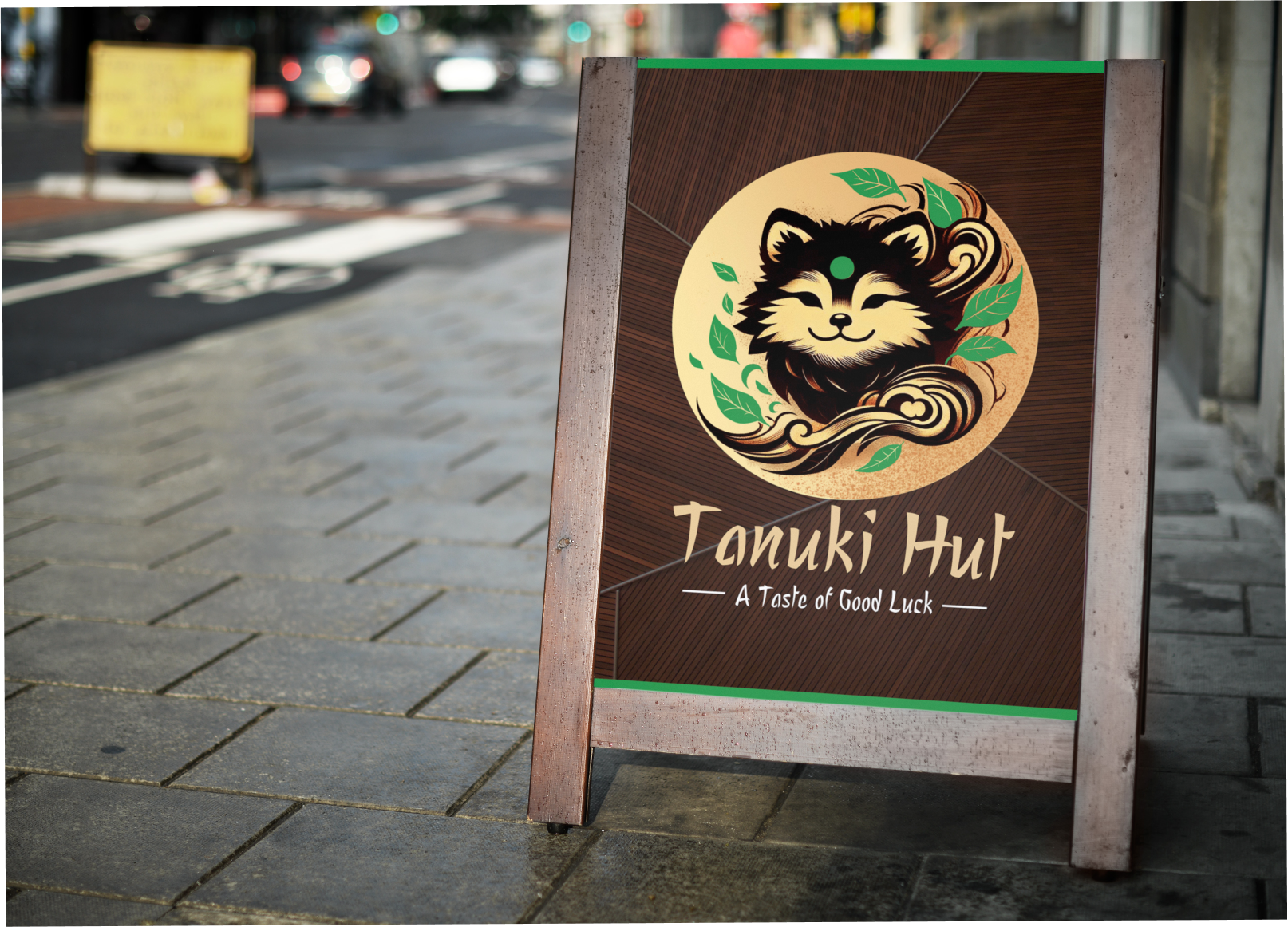
After much research and competitor analysis, a series of cultural brand logos was created and once was eventually selected to be the key image of the brand Identity; The logo for Tanuki Hut features a stylized image of a Tanuki, embracing both the playful and mischievous nature of the animal.
The deep green and brown colours used in the logo and throughout the brand's visuals symbolize nature, health, and sustainability.
Menu Design & Aesthetic
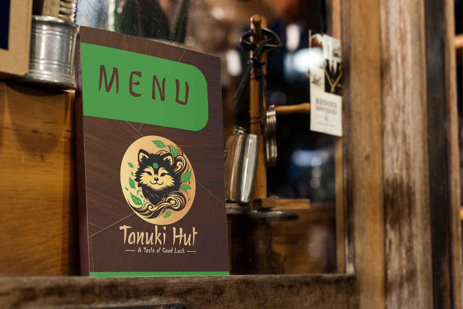
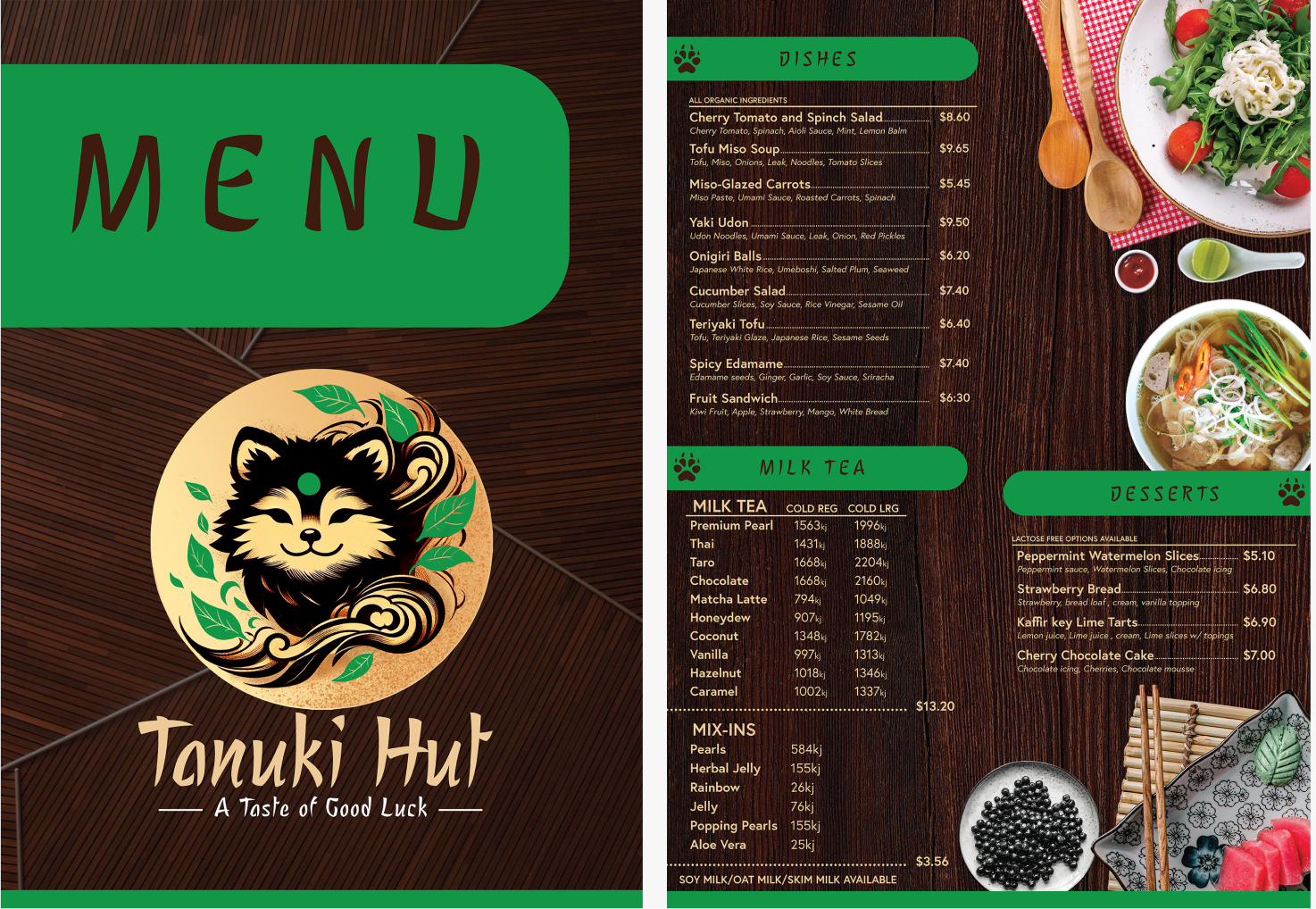
The menu design and marketing materials incorporate Japanese-inspired motifs, such as a Feudal Japanese inspired typography alongside a variety of Japanese dishes and soups alongside dark green and brown earth-tone colours to connect its identity to nature and its cuddly character; paw prints of the Tanuki are also present within the headings of each menu listing, this not only creates a visually appealing aesthetic but also reinforces the brand's connection to Japanese culture.
To further emphasize their commitment to veganism and healthy eating, Tanuki Hut offers a menu consisting solely of plant-based options. This aligns perfectly with their mascot, as the Tanuki represents good fortune and positive energy; and also the earth-tones used.
The motto, "A Taste of Good Luck," reflects the belief that choosing healthy, vegan foods can bring positivity and good fortune into one's life. It also serves as a reminder that Tanuki Hut is dedicated to providing customers with not only delicious but also nutritious options.
Business Identity
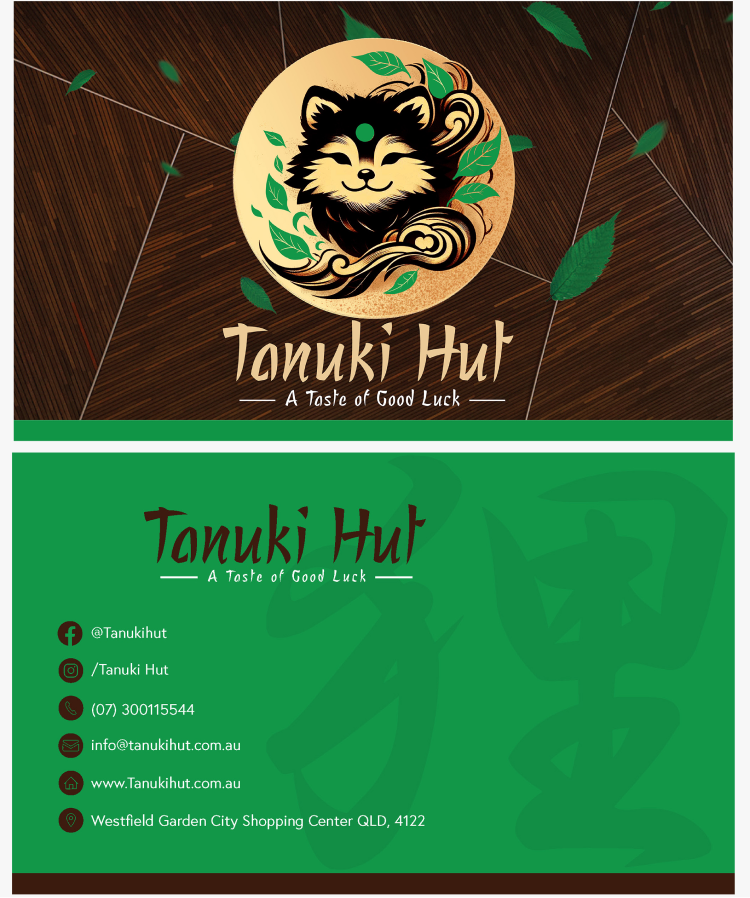
Once the design was finalized, and the content organized and the menu written in a clear and concise manner, I then moved onto business supplies for the Tanuki Hut Shareholders, as the project wanted me to provide both a rebranding of assets, I had created a new brand identity card that represented the Tanuki Hut brand, utilizing established typography, components and assets such as colour palettes and Business Logo.
Also upon the design featured all of their contact information alongside location of Tanuki Hut.
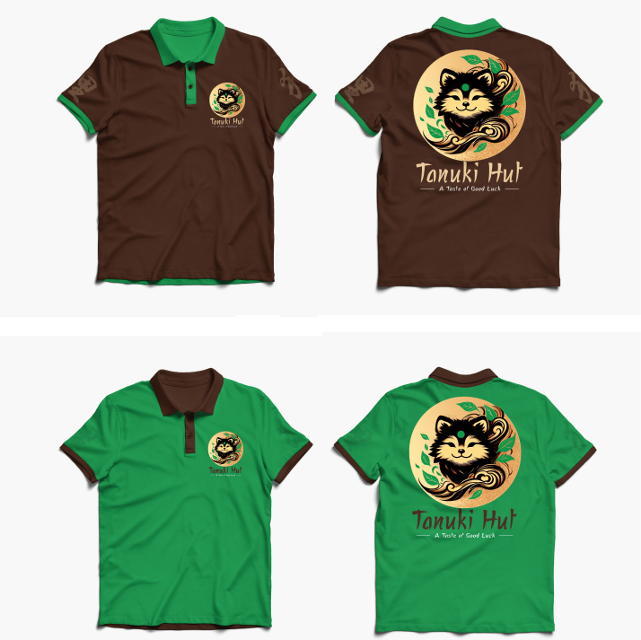
Business Uniform
A business uniform for the Tanuki Hut Business was also created, representing all of the aesthetic present within the menu and the brand identity itself, featuring two versions with pre-established typography and components used within the Menu and other Assets.
Final Thoughts
Tanuki Hut was a fun opportunity to let me draw on my creativity to create a project that lined with my own personal interests, and it allowed me create a brand identity that, I feel, stood out against competitors in the Japanese Cuisine industry; The producing of a menu for a restaurant was a new experience for me and it let me push my skills while under the conditions of restraints, and for that I believe it’s increased my skills as a designer.
Mockups
