Micro Bank
MicroBank was a group project that consisted of a handful of other designers given the task of producing a bank app that’s primary feature was having a form of a group-pay that a series of users that existed in the group itself would all be able to track and pay rent or bills and have it be visible to the group; the target demographic was typically people in university or other such shared living situations.
Strategy & UX
The goal of the project was to produce a functional application for banking that utilized a feature for a group-pay system that a series of users could monitor and take part in, the challenge itself was that half way through the projects creation the task would be altered, initially just being a banking app with a design and an idea in mind, only with a minimal amount of time left were we to integrate the group-pay system and having it naturally flow and be a part of the initial project.
We had begun user research in asking the designers in the group alongside faculty of the project to give us their experiences with mobile banking apps alongside user research, absorbing information from interviews and surveys on what a user would enjoy in the app that might make their flow and use easier and more manageable, we had delved into competitor/comparative analysis, that proved fruitful on utilization of the best practices and user flow that gain an advantage against competitor applications.
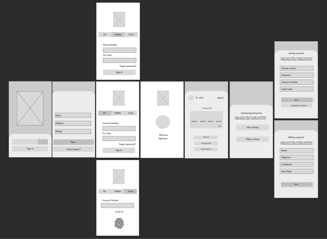
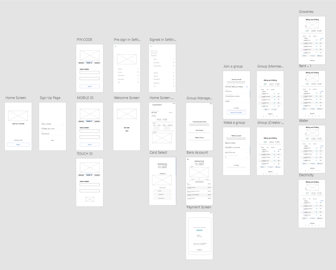
Below are the wireframes samples we had produced during the phases of research and UX analysis, focusing on the production of a bank app that allowed for the usual utilization of a bank app, taking user flow and experience into account alongside the user interactivity to gain access to all sources of information desired by the user.
Aesthetics & UI
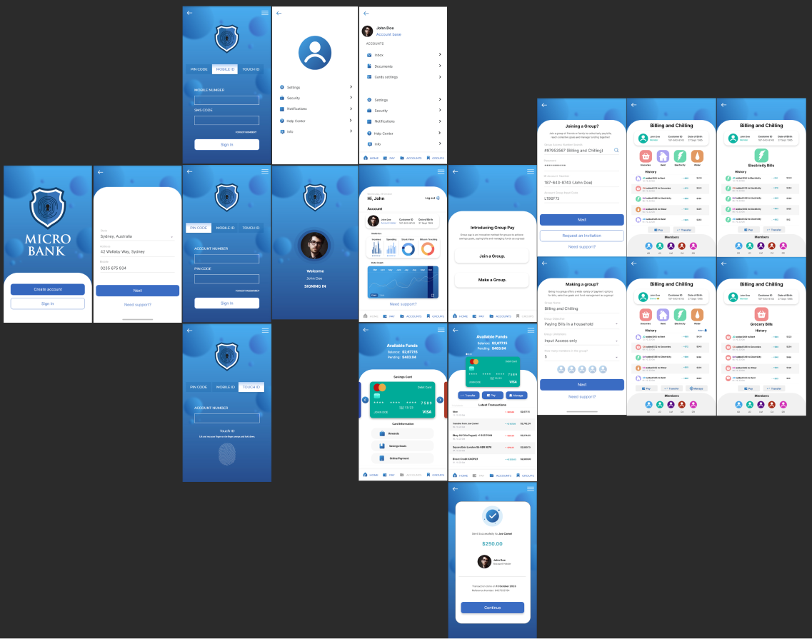
The idea of the design itself was pre-established before the creation of the application, MicroBank, given to us by the faculty of the project and a rough outline of what was expected began the creation period of the application, MicroBank being a literal micro bank that the user could use on their phone for online banking services.
We had taken Colour Theory into account in the creation process, competitor analysis revealed to us that blue was a strong colour used in the handling of information and trust in both graphic design and marketing applications, so it made sense to follow the aesthetic and palette of blues to give the user a sense of calm, control and trust with the handling of their funds and information; followed by a aptly designed logo of a shield, a lock and a fingerprint to symbolize it’s online secure nature.
The UI design is a modernistic yet simple design that utilizes trends popular in the PD and GD industries; the components used were designed to create a simple and efficient flow for the user whilst providing information that the user can find.
User Control
The primary objective to the project is to give the user the option to access their account details and information via menus or tabs for easier, efficient user flow.
Taking accessibility into account with varying flow paths a user can take to arrive at their desired destination within the app; doing this will allow the user to check their bills and account management whilst also being able to monitor their group-pay management system both as an owner or a group member.
Final Thoughts
Creating a project with many varying voices, ideas and opinions was a new experience when designing something, it streamlined a lot of the UI/UX by having multiple people working on different pieces and providing their inputs on accessibility and interactivity, it helped broaden the project and provided insights that I may of otherwise missed when working independently.