Corvine Design
Corvine Design is a Portfolio Project website that served as a prototype iteration of the late Lunarnaut Project, the project itself served as a portfolio website to feature varying assets and components used in multiple digital fields of Graphic Design, Digital Illustration and Product Design and was created in collaboration with a Developer to produce and develop the website into completion.
Strategy & UX
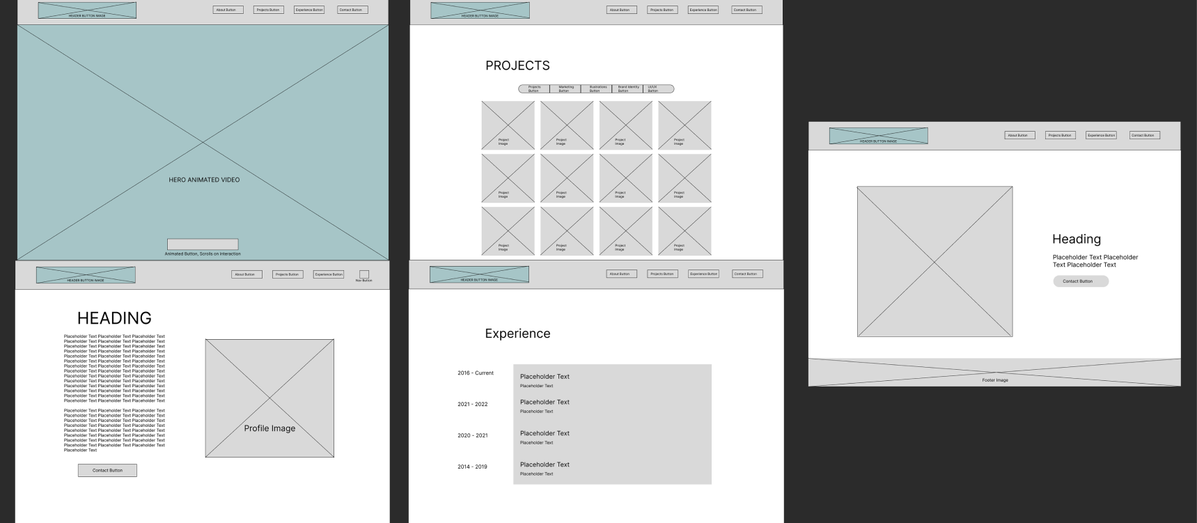
To start the project, I conducted research to determine the target audience and their expectations when visiting a portfolio website. I also explored and analysed other portfolio websites to gather inspiration and understand current trends in the industry.
Based on my research, I created wireframes and mock-ups to outline the structure and visual design of the website. This involved designing a user-friendly and intuitive navigation system, considering the user flow, and organizing the content in a visually appealing way.
Collaborative Efforts
The collaboration with the developer was crucial in bringing the website to life. We worked closely together to ensure that the design translated well into code and that all the necessary functionality was implemented. This included integrating features such as image galleries, sliders, and animations to enhance the user experience.
Throughout the development process, I continuously tested the website on different devices and browsers to ensure proper functionality and responsiveness. I also made sure that the website's performance was optimized to provide a smooth and fast browsing experience.
Aesthetic & UI
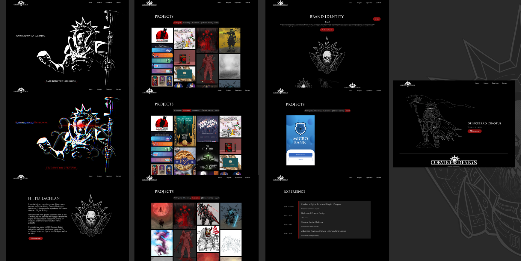
The aesthetic and UI design elements are of a dark apocalyptic cyberpunk visual, featuring strong contrasting colours of black and white, which creates a captivating and immersive experience for users who browse the website and portfolio.
The stark contrast and visual intensity of these colours elevate the overall appeal of the design, making it visually striking and memorable. The UI design, based on this aesthetic, use typography and interactive components that enhance the cyberpunk vibe; using animation components that visually immerse the user and further expands on the personality of the portfolio holder and the products they represent.
Final Thoughts
The design of the project itself was consistent, however upon producing the site and pushing it live I felt as if there was a severe lacking of user flow, what I once thought was effective and efficient proved otherwise, focusing on a grid layout for informational design proved lacking as the users who accessed the website itself found that it was difficult to find the desired information they looked for and the lack of informational hierarchy was present, there was no highlighted information in any of the designs and was only a grid format, because of this the user would lose interest in accessing the sites contents; I sought to rectify these issues after feedback with the Lunarnaut Project.