Component Creation
These assets were created in several varying projects, they would serve as Illustratory graphics or Website components/assets or serve as intros or loading screens. They represent my passion for creating 3D & 2D assets and applying them in illustratory, video or animation purposes.
Lunarnaut Brand Assets
Lunarnaut is one of the Brand Identity’s I’ve created that were to feature a very specific identity and list of components and assets that I created to allow for a constant level of continuity with the design and art direction; with brainstorming and research I was able to produce a brand that I felt represented my key ideals of yearning to discover and better my skills as a designer and the desire to explore uncharted techniques to strengthen my repertoire and to become the best designer I can be.
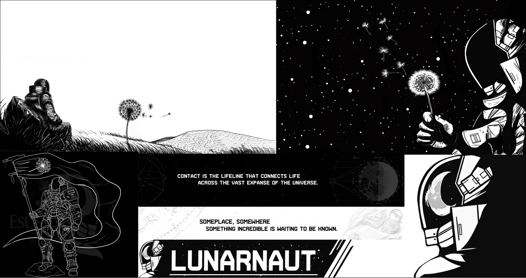
Lunarnaut Animated
This animation would serve as the face of the Lunarnaut website, featuring a star chart background of the constellations, two SVG’s of the moons phases that would be animated and spin on each side of the screen with the Brand Mascot, Esus, in the center holding a small black hole.
The Symbolism featured was to represent mans conquering of even the most fearful concepts, that being the all-consuming black hole, and the charting of the unknown, hence the star chat.
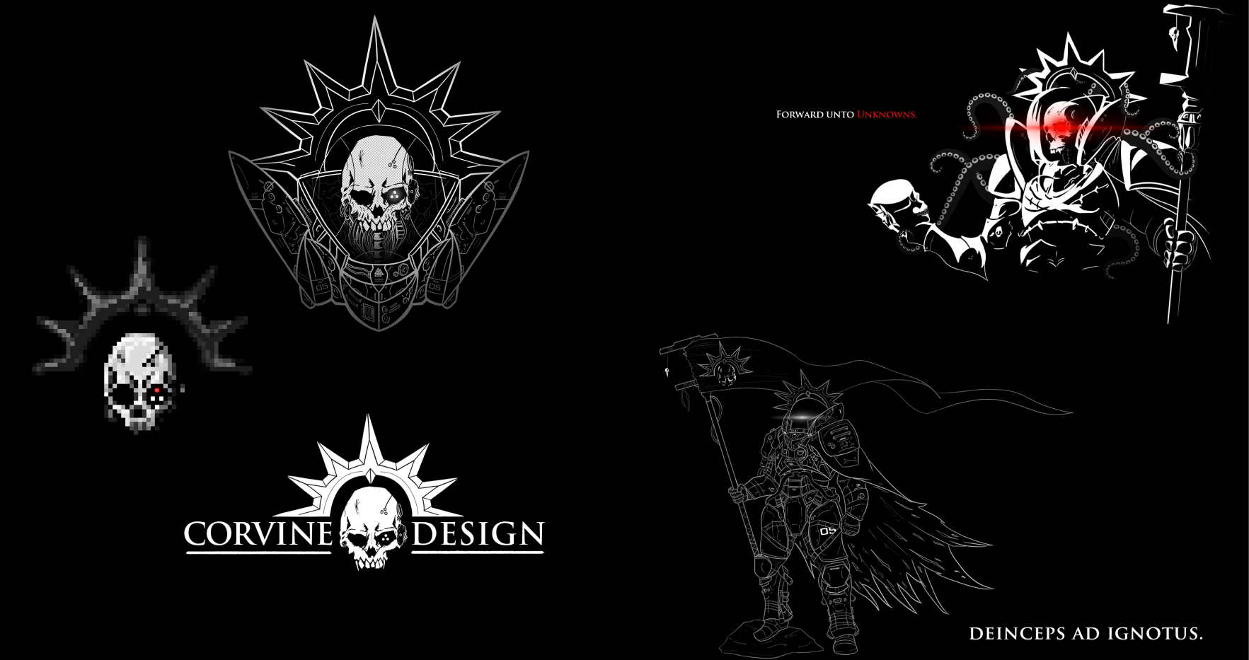
Corvine Design Brand Assets
Corvine Design was a previous iteration of Lunarnaut that featured some similar but also different Components that I had created and drawn up, it also let me produce a level of continuity with the design by following the component library I had built and worked off it, utilizing very specific imagery, art direction and typography; however the use of its assets are now defunct, they still represent the brand identity that I had developed at the time.
Corvine Design Loading
This loading screen asset was produced as a proof of concept for future loading screens that could potentially be used in both a high fidelity or low fidelity uses; Some of the assets present were taken from stock assets but there were also sections of the assets that were hand designed, such as the animations, backgrounds used as the Operating System and the art assets such as the pixelated loading icon.
The aesthetic was meant to represent a 1980’s post-apocalyptic futuristic wasteland vibe, often seen in Blade Runner or Akira.
Corvine Animated Assets
Present in this short video are some animations I had put together utilizing Adobe After Effects and Premiere Pro.
The changing of the image was to represent a function present on the website where the image would be a still image but when hovering over the access button to peruse the Portfolios documents, the image would change and augment, its intention was to add a level of interactivity to the website and represent personality of the websites aesthetic.
The Pixel art served as a loading screen that would play when the websites assets were loading.
Corvine Design Alt
The Original idea of Corvine Design was somewhat simpler in design, featuring a crow with feathers which would adhere to its title identity of ‘Corvine’, however as the brand identity became more technical and the personality and aesthetic shifted the logo and feel of the brand identity shifted.
This video concept was created in Blender, creating a 3D asset of a 2D version of the image was made and implemented in an animation that required technical knowledge to produce the setting and aesthetic.
Corvine Design Alt II
This is a variation of the Concept video, sporting a crimson design, eventually after producing both version they would, in a sense, combine and would exist in the later part of the Alternate version, but also serving as a later colour palette design towards the later iterations with reds, blacks and whites.